Back
Create a Scatterplot Chart -- Excel iOS App
  1. Highlight the entire table you created in Part 2, including headings.
  2. Click Insert, and scroll down to Chart.
The first callout shows that the entire table in Part 2: Table is highlighted. The second callout is showing that under the Insert menu, scroll down to Chart.

  1. Click and scroll until you see XY (Scatter).
  2. Choose the Scatter with Smooth Lines and Markers.
The first callout shows that under Charts, scroll and select XY (Scatter). The second callout shows that you should choose Scatter with Smooth Lines and Markers option for your chart.

  1. Once you have your chart, drag it to Part 3 Chart Area.
  2. Resize it to fit the chart area by tapping the bottom middle square.
The chart will appear in your spreadsheet. Drag it to Part 3 Chart Area. Tap the bottom middle square to resize the chart to fit the chart area.

  1. Click on the chart itself, so the chart tab appears.
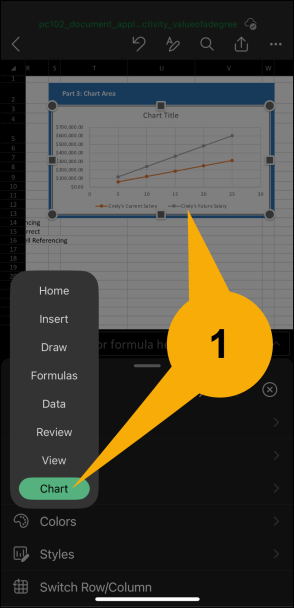
When you click on the chart itself, the Chart tab will appear in the menu.

  1. Double tap on the Chart Title so you can add a name to your chart.
  2. Enter new chart title and single-tap out of it to save the changes.
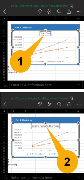
Double-tap on the Chart Title so you can add a name to your chart. Enter the new chart title and single-tap out of it to save the changes that you made.

  1. Select Axis Titles in the menu by clicking Chart from the menu, then Elements, then tap Axis Titles, and tap Primary Horizontal and Primary Vertical.
To add and edit axis titles to your chart, click Chart menu, then scroll and tap Elements, then tap Axis Titles, then select Primary Horizontal and Primary Vertical.

  1. Double tap on the Axis Title so you can enter the titles.
  2. Add "Years" for x-axis, and "Amount Earned" for y-axis to your chart. Single-tap out of each to save the changes.
Double-tap on the Axis Title so you can enter the new titles. Add "Years" for x-axis, and "Amount Earned" for y-axis.